The art of typography has come a long way since the printing press. The invention that first allowed mass printing of written communication changed the world forever, and elements of typography retain that powerful potential today. “Typefaces are the result of hundreds of years of history,” says Lucie Baratte, founder and art director of Logology. “They bring their own connotations and meanings to the picture.”
But for many, typography remains an afterthought in visual design. People love to see a sleek graphic or well-composed photograph on a page, but typography is sort of a foundational given for any composition. Excellent typography blends in as a cohesive element of a design; bad typography can throw an otherwise solid composition off-kilter—even if the untrained eye can’t quite explain why.
Amateur designers often treat typography more like a fashion accessory than an essential element of design, according to Baratte. “But the cultural and social dimension of a letter design matters as much as its aesthetics. A designer needs to be aware of this.”
While there’s a lot to learn about typography in order to completely master it, it can certainly help to know where others commonly are falling flat with this important design element. We’ve asked seasoned designers and typography specialists to share some of the typography mistakes they notice most in a design.
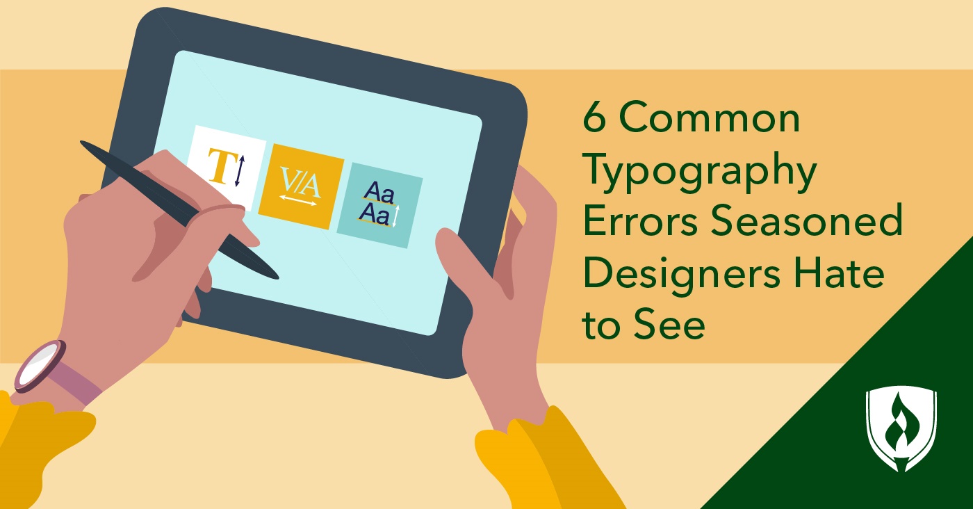
6 Common typography errors designers hate to see...
1. Improper kerning
Kerning is a term that refers to the spacing between letters. “Poor kerning catches my eye like a rusted car,” says Reese Spykerman, CEO of Design by Reese. “At its worst, it can create confusion.”
Spykerman offers an example, “If the word ‘away’ isn’t spaced well between the a and the w, the meaning becomes unclear. Is it ‘away’ or ‘a way?’”
“The first priority, no matter what you’re designing, is legibility,” says designer Eric Keller. “If letter spacing and word spacing are too tight, too loose or not carefully adjusted for key letter pairs, copy becomes difficult to read.” Keller adds that improper kerning also just looks unprofessional, potentially reflecting negatively on the designer, the client and the overall message of the design.
Even if the spacing problems are subtle, Spykerman says they still catch the eye, distracting the audience from the overall intent of the design.
2. Too much center-justified text
Justifying text in the center of a design can be a problematic default. “I think the number-one issue I notice for typography, especially with people DIYing their graphic design, is center-justified text,” says Katie Dooley, graphic designer and founder of Paper Lime Creative.
“People like it because it’s symmetrical, but it’s hard to read large blocks of text because both sides are what we call ‘ragged.’” Dooley explains that left-justified text is far easier for the eye to follow through large blocks of text—making the clarity of the writing optimal.
“Center-justified [text] definitely has its place but should not be the default in a design,” Dooley says. “There are so many ways you can use alignment to your advantage!”
3. Too many fonts
“The number-one typography issue I notice, regardless of whether someone is a newbie or an experienced designer, is the usage of too many different typefaces and font weights,” says graphic designer Milan Mitroviƒá. He explains that only very rare design situations would justify using more than two or three fonts in one piece.
Picking a single pair of fonts that work well together—and adhering to those fonts only throughout the design—works far better than trying to mix and match typefaces, Mitroviƒá explains. “New designers often think more is better when it comes to typography. This is not true.”
4. Inadequate contrast
“Look closely at the white spaces,” Baratte says. “Typography is always about setting up the best contrast for information to be readable, visible and legible.” She explains that font design and visual hierarchy often come down to elements of contrast. Ignoring this can throw visual priority and clarity off balance.
“Examining white spaces will help you put thickness in the right place—it could be on the curve of a letter or the title of a magazine.”
5. Punctuation errors
Wait a second, you might be thinking—is this grammar or design we’re talking about? The two are not mutually exclusive when it comes to typography. “Sometimes, designers forget that typography is a writing code that has rules,” Baratte says. “Making a punctuation mistake for a graphic designer is like making a spelling error for a writer.”
Errors in punctuation might be spacing problems or using the wrong glyph—for example, incorrectly using a hyphen (-) in a situation that calls for an em-dash (—).
“It may seem like a detail, but typography is a matter of details,” Baratte explains
6. Visual clutter and “busy” typefaces
Less tends to be more when it comes to many aspects of design. But this is particularly true in typography. “Too many new designers see typography primarily as decoration,” Spykerman says. This causes them to choose type for its ‘flair’ instead of its utility in helping communicate. Since communication is the priority, this is a real problem.
Spykerman also believes this decorative approach to typography is why designers make the mistake of combining too many typefaces, creating visual clutter the viewer has to wade through.
“The audience misses the message because they’re visually overwhelmed by the type,” Spykerman says. “The net result is confusion and inelegance.”
Harnessing the power of excellent graphic design
When it comes to typography, the devil really is in the details. Even when typography mistakes seem small or subtle, their impacts on the effectiveness of a design should not be underestimated. If designers learn the tools of the trade without understanding the impact and principles behind various elements of design, it’s easy to spend lots of time on work that misses the point.
In an industry filled with artists attempting to stand out, getting a better grasp on truly excellent design can only benefit designers—and their clients. Check out these “7 Things Self-Taught Designers Don't Know They're Missing” to get an idea of how a rounded graphic design education can impact the quality of your work.