Experts Reveal 6 Easily Avoidable Graphic Design Mistakes
By Jess Scherman on 06/28/2014
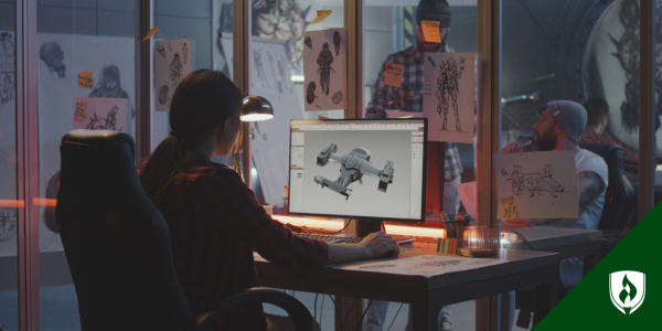
Learning a new trade can be tough—not only do you have to acquire an entirely new skill-set and knowledge-base, but you’re also faced with the difficult task of narrowing down your chosen field. The undeniable increase in social media use has spurred an inevitable boom in businesses both large and small vying for an impactful web presence
As a graphic designer, you can jump on-board with a well-established company as an in-house designer or someday start your own design business and work with a variety of different clients—either way, becoming a graphic designer could be the right path to supporting your family by doing something that you love.
But graphic designers are set to face some tough competition in the coming years, battling other creatives for those highly-valued positions, according to the Bureau of Labor Statistics (BLS). Rather than letting that scare you away from the field you’re starting to love, let that serve as motivation to up your game a little bit!
Those online tutorials can be extremely helpful for beginners, but there are some things you can only learn from years of experience. We asked several design experts to share the most common and easily-avoidable mistakes they encounter on the job. Take a look at the 6 most commonly mentioned categories of pet peeves, and start making your design portfolio as sharp as possible.
6 easily avoidable graphic design mistakes
Graphic design mistake 1: Over-designing
It seems that nearly all design experts are in agreement on this one: don’t over-design your document! “You can tell when someone has just found the wonders of Photoshop,” says George Ioannou, founder and head of agency for Digital & Wise. “Just because you can apply filters doesn’t mean you have to use them,” he adds.
Designers could go on and on about this one. “Let your design breathe!” says Alexis Arizzi, president of Arizzi Creative, urging new designers to avoid designing every square inch of available space.
Kim Kinney, creative manager at Kinney Designs, explains why this is important. “If people have to work hard to gather information, chances are they are just going to skip over your design and not obtain anything. Be clear, clean and right to the point,” she says.
Graphic design mistake 2: Font faux pas
Fonts play an important element in the world of graphic design. And there are a couple different ways to get this one wrong, according to our experts.
“Fonts should be selected based on the ‘feeling’ that you want to convey,” adds Matt Boaman, SEO engineer and programmer for EZSolution. He also urges that using too many fonts in a single document is a classic rookie mistake made by many young designers.
“A good rule of thumb is to never use more than three font families per design. An even better rule is to never use more than two,” suggests Sarah Kinling, marketing and communications specialist for Green & Healthy Homes Initiative.
Conversely, you don’t want to be a one-trick pony. “Using the same fonts in most of your design examples shows lack of creativity and design prowess,” says Andy Waldrop, director of digital strategies for COCG.
Graphic design mistake 3: Losing your message
Many design professionals urge new designers to stay true to the client’s intent—don’t design for yourself! “Don’t just listen. Really hear what the client says to you,” says Arizzi. Grasping the attention of potential customers is the end-goal, but if you’re client is not initially happy with your design, it may not reach those customers at all.
“The number one rule in graphic design is, ‘the customer is always right.’ If they are paying for the design, you should help them achieve their vision,” Kinney adds.
“You aren’t designing for yourself, you are designing for the masses,” says Laura Halliwell, creative director for Teknicks. “Make sure your design reflects that. It all comes down to usability.”
Graphic design mistake 4: Misunderstanding design hierarchy
Design hierarchy (also referred to as ‘visual hierarchy’) is the order in which viewers digest the information on the page. It is important to prioritize the elements of your design so that the message intended by your client is clear and easy to grasp.
Tips to avoid a jumbled hierarchy in your design can vary greatly. Kinney suggests keeping the ‘call to action’ large and noticeable and applying strategic use of white space so that the important information will be easier for viewers to digest. Arizzi warns against ‘screaming logos,’ or making the company’s logo too big and obvious.
“A good way to ensure you have the right hierarchy is to imagine [your design] as a billboard on the side of a highway. If the viewer is speeding by, what are they going to see first?” Kinling advises.
Graphic design mistake 5: Unpolished products
Graphic design is visual by nature. There are some psychological undertones that go into choosing the right font and employing a successful design hierarchy, but some elements of design are more straightforward. Surface-level design mistakes are all-too-common, and often easy to avoid, according to our experts.
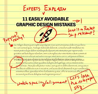
There is a general grid structure to design documents. When graphics or strings of text don’t align with this structure, it is termed, quite fittingly, misalignments. This can often serve as a distraction to viewers. “This is such a simple thing to avoid,” says Ioannou. “Grid layouts are designed to help with eye scanning legibility and create a well-thought-out piece of work.”
“It is the designer’s job to think about the next person who will be working with the document,” says Beth Lacey Gill, director of marketing & communications at Irvine Nature Center. She encourages designers to proofread copy and to pay attention to and fix typesetting problems like ‘orphans.’
Graphic design mistake 6: Lack of organization
Designer-client relationships are of great value to both parties. For that reason, you want to be sure that your design not only meets the client’s expectations and is polished and ready to publish, but also that your files are organized and easily accessible to any possible second party.
“Name your layers, and take advantage of groups and folders—and name those, too!” says Arizzi. “Trust me, at some point someone else will need to open your files. Have an organizational system for naming your files and stick to it,” she concludes.
Boaman agrees that cluttered Photoshop files, a lack of folders and no apparent naming structure will prove problematic for designers. “Are you really going to remember 6 months from now which layer that starburst was on?” he jokingly questions.
“I know we are designers and we aren’t held down by order, but believe me, you don’t want to upset the man who is putting your design to life,” Halliwell adds. “Start the project off on the right foot and make sure he can easily access the layers he needs so that the project can run smoothly.”
What’s next?
You have more than enough bravery to branch out and try something new, and you’re adaptable—a skill that’s likely been enhanced from the non-stop evolution of being a parent. A career in graphic design could be the perfect way to stretch your creative muscles while also challenging you intellectually.
Use the insight from our design experts to polish your portfolio and keep pushing forward. But remember, it doesn’t end there. “The industry is constantly evolving. It is extremely important to stay on top of that,” encourages Halliwell.
A degree in graphic design can help you stay ahead of the curve and hopefully beat out the competition for that big job you’ve been hoping for. Check out these 4 reasons why earning a graphic design degree is worth it.
For more information on how it can provide you with everything you need to know to be successful in the field, head over to the Rasmussen College graphic design degree page and take the next step in your journey toward design success.