Designers Weigh In: Why Does Everyone Hate Comic Sans So Much?

Why Does Everyone Hate Comic Sans

All fonts are not created equally.

Some we hold close to our hearts, our tried and true go-tos. Some we dust off for special occasions. And some we keep locked away, never to be used in the light of day.

One such font has become the bane of the typeface world. It makes a laughing stock of its users and has grown to become universally despised.

It’s Comic Sans – and it’s not going anywhere anytime soon!

But hey, Comic Sans has had a rough life. Shouldn’t we cut it some slack? After all, it’s not easy being the most hated font of all time.

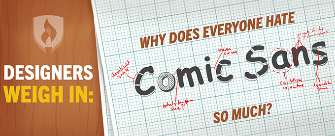
Join us as we implore this funhouse font and answer the question: Why does everyone hate Comic Sans so much, anyway?

The life & times of Comic Sans

It’s a bird! It’s a plane! No, it’s….Comic Sans?

The year is 1994. Forrest Gump dominates the box office. OJ Simpson has just been arrested. And Comic Sans is born to an unsuspecting world.

Vincent Connare was working as a font designer for Microsoft at the time. Struck with a clap of inspiration, he envisioned a font based on the lettering of the comic books he had spread across his office … and the rest was history.

But there’s one more thing you need to know. Connare created Comic Sans for children’s applications, cartoon guides and speech bubbles, intending that it only be used for those purposes. It was not meant to be included as a font in other applications, but we all know how that story ends.

Comic Sans was added to the font collection in Windows 95 and has since grown to become a staple in the typeface cannon.

Why Comic Sans is so visually terrible?

Comic Sans is a sans-serif font (hence the name.) The font also has an unmodulated stroke, which means as the lines within a letter curve, they don’t vary in thickness or thinness as it would if you wrote in a flat-tipped pen. Most fonts with an unmodulated stroke are adjusted for ease of viewing.

For example, Helvetica’s unmodulated stroke is adjusted slightly in the curves of letters to better balance the visual weight. The imbalance of visual weight in Comic Sans makes for a taxing reading experience. Blocks of lettering don’t allow for smooth, uniform reading, making for an uneven “texture” and legibility. As if that wasn’t bad enough, Comic Sans has terrible kerning. The spacing between letters is awkward and uneven.

Comic Sans sympathizers

Ok, let’s face it. Some people like Comic Sans. That’s why you see it misused all over the place.

Ty, the makers of the quintessential 90s toys Beanie Babies, chose the font to portray their empire. So did EA Games’ The Sims. Apple even created its own knockoff version of the font – Chalkboard. It seems there was a time Comic Sans was America’s sweetheart of fonts. But oh how the tides have turned.

But really — why does everyone hate Comic Sans so much?

Just when did the tide turn? When did the masses rise against the monument of Comic Sans? It’s tough to say. Was it the rampant misuse of the font that was never meant to be? Was it our emerging tech-savviness as the 90s faded away? One can’t be sure.

But what is certain is the disdain for the font today – and the feeling appears to be widespread. Two disgruntled graphic designers founded Ban Comic Sans in 2002. Time magazine even condoned the font in their list of the 50 Worst Inventions. And the mockery of Comic Sans recently became immortalized in the world of memes and Internet jokes.

Perhaps it’s the misuse of application that has fueled the loathing of Comic Sans. A notable example of the font’s mishandling came from Lebron James’ departure from the Cleveland Cavaliers, recalls UX designer and Comic Sans hater Gene Caballero.

The team’s owner, Dan Gilbert, posted a heated rant on James leaving, but did so unfittingly in Comic Sans, much to the internet’s delight. The letter quickly became a laughing stock and has since been deleted.

But the misuse of Comic Sans expands far beyond Gilbert’s note – featured on funeral notices, the sides of ambulances and security alerts as far as the eye can see. Even the Vatican released a farewell photo album upon the retirement of Pope Benedict XVI, entirely in Comic Sans.

"99% of the time we see Comic Sans used, it's being used badly."

“Comic Sans, putting it lightly, hurts my feelings,” says creative design manager Janice Omadeke. “Why, out of all of the amazing fonts that are in a standard font library, would someone pick that font?” She adds that from a design perspective, the font has a childish nature.

Graphic designer Amanda Guerassio points out that the font is commonly assumed to have a fun, informal feel – and it is often misused in large blocks of texts, rather than left just to headlines.

“Those two issues combined mean that 99 percent of the time we see Comic Sans, it's being used badly,” she explains. “That's why it's come to be so hated. It's become the standard bearer for recognizing bad or amateur design.”

Now you know…

In such a torn, divisive world, there are few things that can pull people together like an unfavorable font.

Will we ever stop hating Comic Sans? Will it eventually fall back in fashion? Will it ever be plucked out of our standard font portfolios? We can’t be certain – but for now, it seems Comic Sans has fallen to the wayside for designers and the general public alike.

To avoid other embarrassing design blunders, check out our article: Experts Reveal 6 Easily Avoidable Graphic Design Mistakes.

RELATED ARTICLES:

About the author

Kristina Ericksen

Kristina is a Digital Writer at Collegis Education where she creates informative content on behalf of Rasmussen University. She is passionate about the power of education and enjoys connecting students to bright futures

writer

Related Content

Related Content

This piece of ad content was created by Rasmussen University to support its educational programs. Rasmussen University may not prepare students for all positions featured within this content. Please visit www.rasmussen.edu/degrees for a list of programs offered. External links provided on rasmussen.edu are for reference only. Rasmussen University does not guarantee, approve, control, or specifically endorse the information or products available on websites linked to, and is not endorsed by website owners, authors and/or organizations referenced. Rasmussen University is accredited by the Higher Learning Commission, an institutional accreditation agency recognized by the U.S. Department of Education.

logo-accreditation-acen logo-accreditation-ccne chart-credential-laddering-associates-bachelors-masters 0 Credits 90 Credits 180 Credits 48 Credits Start Here HIGH SCHOOL GRADS Start Here TRANSFER STUDENTS Start Here SECOND DEGREE PURSUERS End Here ASSOCIATE'S DEGREE Start Here MASTER'S DEGREE PURSUERS End Here BACHELOR'S DEGREE End Here MASTER'S DEGREE chart-credential-laddering-associates-bachelors 0 Credits Start Here HIGH SCHOOL GRADS Start Here TRANSFER STUDENTS 90 Credits Start Here SECOND DEGREE PURSUERS End Here ASSOCIATE'S DEGREE 180 Credits End Here BACHELOR'S DEGREE chart-credential-laddering-msn chart-credential-laddering-nursing-programs chart-credential-laddering-nursing DNP MSN RN to BSN LPN to RN Bridge Accelerated BSN Professional Nursing ADN Practical Nursing Diploma Pre-Licensure Post-Licensure icon-colored-outline-bank icon-colored-outline-certificate icon-colored-outline-circle-dollar-sign icon-colored-outline-folder-search icon-colored-outline-hand-heart icon-colored-outline-head-blocks icon-colored-outline-head-cog icon-colored-outline-head-heart icon-colored-outline-health-plus-leaves icon-colored-outline-hospital icon-colored-outline-lifelong-learning icon-colored-outline-light-bulb-analytics icon-colored-outline-location-pin icon-colored-outline-magnifying-glass icon-colored-outline-monitor-healthcare icon-colored-outline-monitor-paper-search icon-colored-outline-nurse-rays icon-colored-outline-padlock-shield icon-colored-outline-person-presenter-screen icon-colored-outline-scales ras-logo-flame ras-logo-horizontal ras-logo-stacked icon-colored-advance icon-colored-arrows-cross-curve icon-colored-briefcase-star icon-colored-build icon-colored-bulb-analytics icon-colored-certificate icon-colored-continual-development icon-colored-duo-chatbox icon-colored-folder-mortarboard icon-colored-forward-ribbon icon-colored-gears-clock icon-colored-globe-pen icon-colored-growth icon-colored-hand-bubble icon-colored-hand-stars icon-colored-hands-gear icon-colored-head-blocks icon-colored-head-cog icon-colored-health-plus-leaves icon-colored-hospital-building icon-colored-laptop-cbe-skyscraper icon-colored-laptop-checkmark icon-colored-laptop-webpage icon-colored-location-map icon-colored-location-pin icon-colored-monitor-paper-scan icon-colored-mortarboard-dollar icon-colored-national icon-colored-people-chat-bubbles icon-colored-person-cheer-star icon-colored-person-laptop-checkboxes icon-colored-person-screen-instructor icon-colored-person-whiteboard icon-colored-phone-chatbox icon-colored-police-light icon-colored-prep icon-colored-presenter icon-colored-regional icon-colored-save-time icon-colored-shirt-hat icon-colored-skyscraper icon-colored-state icon-colored-student-centered icon-colored-support icon-colored-world-experience icon-triangle-arrow-up-plant icon-triangle-calendar-pencil icon-triangle-clock-rotating-arrows icon-triangle-display-gears icon-triangle-hand-right-speech-bubble icon-triangle-laptop-coding-brackets icon-triangle-mortarboard icon-triangle-paper-ribbon icon-triangle-person-cheer-star icon-triangle-person-juggle icon-triangle-triple-people-chat-bubble icon-modality-campus icon-modality-field icon-modality-online icon-modality-residential icon-arrow icon-bank icon-camera icon-filter icon-general-chart icon-general-connect icon-general-degree icon-general-discuss icon-general-email icon-general-find icon-general-hat icon-general-heart icon-general-laptop-building icon-general-laptop icon-general-leader icon-general-map icon-general-money icon-general-paperwork icon-general-people icon-general-phone icon-general-speak-out icon-head-heart icon-info-circle icon-mail-forward icon-mglass icon-play-solid icon-quote-mark-left icon-quote-mark-right icon-scales icon-share-square-o icon-simple-chat icon-simple-desktop icon-simple-find icon-simple-hamburger icon-simple-phone icon-spinner icon-tag icon-testimonial-quotes icon-util-checkbox-white icon-util-checkbox icon-util-checked-white icon-util-checked icon-util-chevron-down icon-util-chevron-left icon-util-chevron-right icon-util-chevron-up icon-util-circle-arrow-down icon-util-circle-dot icon-util-language-switch icon-util-loading icon-util-open-window-link icon-util-pdf-link icon-util-refresh icon-util-x rebrand-arrows icon-social-facebook-colored icon-social-facebook-square-colored icon-social-facebook-square icon-social-facebook icon-social-google-plus-square icon-social-google-plus icon-social-instagram-colored icon-social-instagram icon-social-linkedin-square-colored icon-social-linkedin-square icon-social-linkedin icon-social-pinterest-p-colored icon-social-pinterest-p icon-social-twitter-colored icon-social-twitter-square icon-social-twitter icon-social-youtube-play-colored icon-social-youtube-play graduate-cap-star-coin hand-coin hand-heart nurse-stethoscope-rays card-send-smile person-yoga-pose suitcase-star