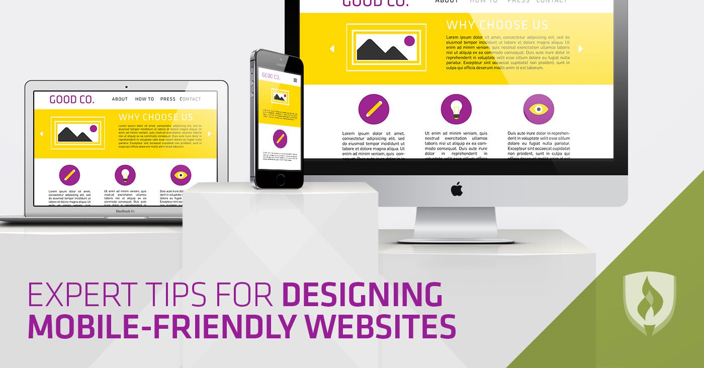
The vast majority of Americans now own a mobile device of some kind—95 percent of them to be exact, according to the Pew Research Center. The world is shifting, and technology is causing the way we interact with information to change dramatically
The ability to get directions with a simple tap of your thumb or browse restaurant options in your city with an easy scroll of the finger has revolutionized what it means for humans to access data and instruction. This easy access to information is certainly making life a lot easier, but it’s also causing a lot of change in the world of web design. User experience (UX) changes depending on the device one is using—which means web designers need to ask themselves tough questions about the look, feel and ease of use of their websites on mobile devices.
Why is designing for mobile so important?
In October of 2016, mobile web usage took over desktop usage for the first time when 51.3 percent of web pages were loaded on mobile devices. The shift to mobile is not just a concern for future planning—it has arrived.
This data is crucial for businesses to be able to understand the best way to market to consumers. It’s also essential for web designers because it means that websites must be mobile-friendly if they’re going to have any sort of impact. As smartphones continue to become more of the norm, industries that rely on the web must adjust their approach to UX design and shift their methods of advertising.
Expert tips for designing mobile-friendly websites
So what are the latest and greatest trends when it comes to designing mobile-friendly websites? Are there best practices when it comes to designing mobile-first? We connected with experts who are on the cutting edge of this new movement and compiled a list of helpful tips for designing mobile-friendly websites.
1. Focus on efficiency and remove unnecessary elements
“Pare it down,” advises Paolo Vidali, founder and CTO of Hidden Gears, a web development company focusing on e-commerce.
“Using Javascript, hover-states, and animation libraries can make nice user experience on desktop but won't matter for mobile,” Vidali says. “Focusing on efficiency and intuitive responses will be a much better use of design and build time.”
While all the bells and whistles you’d find on a desktop-version of a website might add a certain allure to the site, they aren’t nearly as important on mobile versions. When accessing information, users want a fast and easy way to get the answers their looking for, and if they have to load a bunch of flashing lights and animations before they can get to the particulars they need, they could get frustrated and abandon the website before it even has a chance to load.
“My most valuable tip for mobile design is to brutally remove anything from the screen that isn't pulling its weight,” says Mike Finch, a designer at SpiderOak. “Anything on the screen should have to fight for its existence to be there.” He says if you can't justify the importance of an object—anything from unnecessarily wordy content to distracting UI or rarely-used features—it should be omitted.
Keep things simple, and you’ll keep site viewers focused on what matters most.
2. Content is king
“When you think about designing for mobile, you need to think about what is most valuable to the user,” says Jaffy Escarcha, a web developer for Laughing Samurai. “Unlike in the desktop version, with mobile you are limited by how many pixels you have—so when designing, you need to make sure that the most important content is going to show up first.” This echoes the prior tip because sometimes it just comes down to cutting out the fluff.
Make sure your most important messages are front and center when you’re designing for mobile. Put your key content in easy-to-see locations, and avoid hiding important pages and information in drop-down menus or buried in a series of hyperlinks.
It’s also important to make sure you don’t have too much content on your mobile website. Mobile devices have small screens, and if the user has to scroll for ages to access the information they need, they’re going to abandon the cause earlier rather than later.
3. Make it “finger-friendly”
“Mobile consumers are constantly on the go, and they have less than five minutes to consume your content while waiting in line at a Starbucks,” says Sophorn Chhay, an inbound marketer at Inboundo. “You need to ensure that the action that you want your visitor to make is clearly defined, and make sure it is finger-friendly by designing your buttons to be 7–10 mm in size. Make it easy for them to click.”
Mobile devices are solely navigated with fingers and fingers alone. If clickable elements on the screen are too small or ill-defined, it’s going to be tricky to get your users to actually take action on your website and select what you want them to click. Make things easy for everyone, and choose design elements that are easy to select.
4. Pay attention to sizing
“Just because a website fits neatly into a screen, doesn't mean that it's properly optimized for mobile devices,” says Aaron Lin, managing director for Ignitive, a web design company. “Pay close attention to those pesky font sizes and how they scale down and appear against a background. Image backgrounds don't always scale properly, which forces you to use a crop in CSS instead.”
One of the main differences between mobile-friendly websites and desktop versions is how they scale down to fit the size of a mobile screen. If the images and design of your website are shifting correctly, but the fonts stay super tiny, users won’t be able to read the words on your website. Make sure your coding is correct, and always test things out before you go live.
5. Optimize images to load quickly
“Often people on mobile devices are not hooked up to Wi-Fi and must rely on their cell service to download data,” says Jeff Kear, owner of Planning Pod. “This means that big file sizes will load very slowly, so you should make it a point to keep your file sizes small while maintaining high image quality.”
There are a variety of free online tools, such as JPEG Optimizer or Optimizilla, available for use, but hiring a team of web designers and coders who know what they’re doing is going to be your best bet for a successfully designed, mobile-friendly website.
The future is now
We’re no longer looking ahead to future projections about mobile usage—the future is here, and mobile-friendly websites are a requirement for success.
“Optimizing your website for mobile used to be a simple perk; an optional feature your website could boast to set itself apart from the competition,” explains Keval Baxi, CEO of Codal. “That is no longer the case. The bar has been raised—the baseline elevated. If your website isn't mobile-friendly today, it is essentially useless, a relic of a bygone era.”
Mobile web design is a booming career field, and you certainly won’t get bored with its ever-evolving landscape. If you find web design fascinating and want a little help keeping up with these changes, check out our article, “ 8 First-Rate Resources for UX Design Enthusiasts”.
RELATED ARTICLES:


