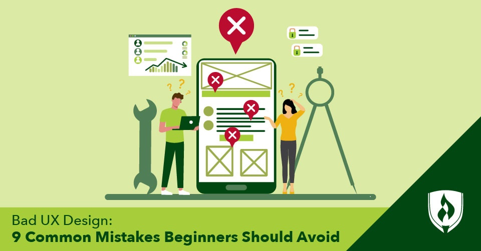
You’ve probably wound up on a website or app with a design that leaves you wondering what on Earth the creators were thinking. Whether it’s struggling to find the information you need, unclear icons or genuine confusion at how to navigate the overwhelming visuals, bad UX design can render an otherwise visually appealing effort into a difficult-to-use mess.
In a world that’s increasingly dependent on good design to help people find information in as little time as possible, UX design blunders can stick out as particularly frustrating.
The good news is that often there’s a rational reason behind these mistakes—and many are easy to avoid if you are aware of them.
Keep reading to learn more about some of these common bad design instances and how to avoid them.
9 Common UX design mistakes
1. Too many pop-ups
You’ve probably been preparing to read a news article when as the page loads, three pop-ups cover all the content. Between a warning about cookies, an ad and an email list sign-up, the user’s primary concern—the article—can get almost completely obscured.
While one pop-up isn’t too annoying, it’s easy to overdo it. In web design, many of these pop-ups are the product of third-party apps and advertisers that you may have limited control over—so focus on what you can to simplify how information is presented in the areas you do control. Ask yourself: Could this be contained to a sidebar or a “more information” icon that’s accessible when hovered over? Not all information needs to be jumping off the page and jockeying for attention, so keep pop-up messaging to a minimum.
2. Aesthetic over functionality
Demonstrating your design ability with an intricate or out-of-the-box layout may seem like a great design portfolio project. For the user, though, this design may be unintuitive, leaving them to struggle through the website trying to find what they’re looking for.
And while it’s possible for an innovative design to be user-friendly, it can just as easily confuse new users who are unfamiliar with the layout. Instead, starting the design process by thinking through functionality then building the visuals and layout will create a UX design that balances functionality and aesthetics.
Sometimes, the clean, simple design is better than the flashy, complicated layout.
3. Impractical fonts
While fonts often are a UI specialty, UI and UX often overlap, and like intricate layouts, a fun or fancy font can be the perfect way to grab attention or show off your design skills. However, a font with too many flourishes can be tricky to read—it’s like struggling through bad handwriting. The last thing you want is a thoughtfully crafted message that readers struggle to read because of the font.
As with the design, the best fonts balance functionality with appearance. For instance, a loopy, specialized font could work great for accents while the bulk of the writing will be easier on the eyes in a more conventional style.
4. Too much at once
While it’s critical to include all the essential information, having too much information on a website can overwhelm users. Whether there are paragraphs on paragraphs of text or a long scroll to get through all the images and graphics, users’ attention span will run out before they get through all the information.
Learning how to balance what information needs to be included and what doesn’t can condense content. And learning how to convey information efficiently—creating graphics and other design elements where helpful—will give the user everything they need to know while staying away from sensory overload.
5. Overly long dropdown menus
While organizing pages into dropdown menu folders can create a super navigable website for users, dropdown folders that are too long can disappear below the bottom of the screen. It’s incredibly frustrating to not find what you need on a website because it’s hidden at the bottom of a too-long dropdown.
Another consideration here is that different users have different screen sizes. What works for the large monitor you have in the office may end up partly hidden for people who use a portable laptop.
6. Not mobile friendly
Another common error related to different screen sizes is websites that are not mobile friendly. Trying to navigate a desktop website on your phone or a website that poorly attempts to squeeze itself onto your phone screen, often with overlapping or missing elements, can be nearly impossible. This is why when creating a layout, the best designers will consider how their design will translate to a mobile situation.
7. Inaccessible color combinations
Did you know that eight percent of men and 0.5 percent of women are color blind?1Some color combinations (like red on green) are hard for color blind people to discern. As a result, it’s important to consider how different color combinations can affect whether color blind people can use your design. Alternatively, some websites now have accessibility options that can change the colors on the site to be more suitable for the different kinds of color blindness.
8. Hiding important information
Nothing is more frustrating than looking for something and not being able to find it. When designing any project, it’s important to put the most critical information front and center and structure the rest of the information in a navigable and intuitive way.
Burying pages and links that users would frequently access amongst submenus is a design headache. Knowing what users are likely looking for and creating an interface that is intuitive to navigate is key to creating the smoothest user experience.
9. Slow-loading pages
The best designers are able to think beyond their design to consider the limitations and functions of the medium. With UX design, internet speed is a huge limiting factor for many people. While the auto-playing, high-resolution video on your website’s home page may be amazing, it may stop the page from loading for somebody who doesn’t have lightning-fast internet.
In these situations, keeping file sizes for pictures and videos small via compression tools can help chip away at the overall amount of information that must load on each page.
Is a career in design for you?
There’s undoubtedly no shortage of bad UX designs out there, frustrating users and good designers alike. While the forms these less-than-ideal design mistakes take are varied, they all can be mitigated by keeping the needs of a user near the top of all design considerations.
Whether you’re getting started in graphic design or web design or are just looking for ways to improve your work as a creative professional, it never hurts to empathize with your audience and think through their overall experience when taking in your work. Putting users first has grown so important in this field, user experience design is now an established role many digital creatives dabble in. Want to learn more? Start with “What You Need to Know to Become a UX Designer.”
1“About Colour Blindness,” Colour Blind Awareness. [Accessed July 2022] https://www.colourblindawareness.org/colour-blindness/.