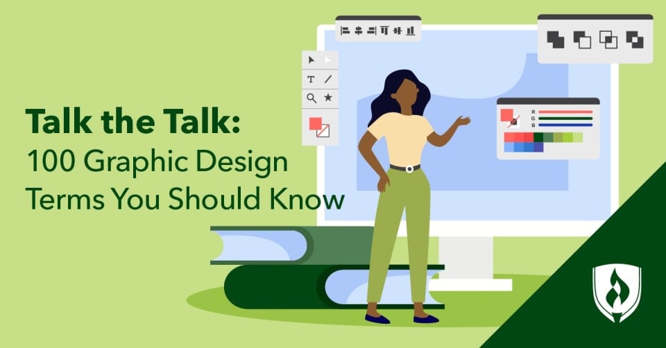
You’ve got a creative mind and a desire to apply your design talents in a creative career. But it can be a little intimidating to hang out with a group of designers who casually throw around industry design terms you don’t see every day: Kerning? Saturation? Bleed?
While it might be a bit confusing at first, learning the lingo will not only make you feel like you’re up to speed with seasoned designers, but give you the vocabulary needed to accurately describe your work. We’re here to help turn imprecise language like “those things on a letter” into their more on-the-spot description (serifs, in this case). We’ve compiled a useful list of 100 graphic design terms and concepts you’ll likely encounter in your time as an aspiring designer.
100 Common graphic design terms you should know
While this is not an exhaustive list of graphic design terms, it is a great place to start. Read on to start building your graphic design vocabulary.
Design terms: The basics
1. Body copy
The main text of any sort of design. The body copy is distinct from the logo, headline or subheading. You’re reading body copy right now!
2. Comp
A rough version of your design that is often created as a pencil sketch, but it can be digital as well. Short for “comprehensive layout.”
3. Mock-up
A realistic representation of how the design will look—a scale or full-size model of the design used to demonstrate, promote and validate the design. This can also be referred to as a design “proof.”
4. Mood board
A collection of like or complementary images and texts that cohesively construct a potential overall aesthetic for a project or brand.
5. Typography
The design and selection of letters on the printed page. With the invention of the printing press and the central role technology plays in our world today, typography has become one of the main facets of graphic design. Many designers are really passionate about it—for more, check out “6 Common Typography Errors Seasoned Designers Hate to See.”
6. Aspect ratio
The quantitative relation between an image's width to its height. Perhaps the most common aspect ratio you’ll hear about is 16:9, as that is the ratio in most high-definition televisions and computer monitors.
Design terms: Images and formats
7. AI file
A vector image (see below) format used for original Adobe® Illustrator design files.
8. DPI
Acronym meaning “dots per inch.” A higher dpi means a more detailed image, but limitations may remain depending on the type of format the image will appear in.
9. EPS
A vector image (see below) format often used for high-resolution printing.
10. GIF
Whether you pronounce it with a hard or soft G, it’s a raster image (see below) format best for animation and transparency in limited colors.
11. JPEG
A JPEG (or jpeg or Jpeg) is an example of a graphic image file type that contains bitmaps. It is created for compressing full-color or grey-scale digital images of real-world scenes.
12. PDF
A raster image (see below) format best used for print files and web-based documents.
13. Pixel
The smallest unit of a digital image or graphic that can be displayed and represented on a digital display device.
14. PNG
A raster image (see below) format with millions of colors available.
15. PPI
Refers to “pixels per inch” and measures the density of pixels used on electronic devices, like camera screens or monitors.
16. PSD
A raster image (see below) format best for layered Adobe Photoshop design files.
17. Raster image
A raster, or bitmap, image is a graphic that is composed of a grid of pixels, with each pixel having values for color, hue, saturation and transparency. Unlike vector images, these graphics do not scale well and will become pixelated as you “zoom in” or enlarge the graphic.
18. RAW
A raster image (see above) format best for unprocessed data from digital cameras.
19. Resolution
A measure of image quality based on dots per inch for printed works and pixels per inch for digital work. The higher the resolution, the crisper the image will be.
20. Stock photo
Licensed images available for designers to use that negate the need for the designer to coordinate an entire photo shoot. Learn more in our article, What Are Stock Photos? A Guide for Creative Newcomers.
21. Texture
Can refer to either the actual physical feel of a design or the way a viewer imagines a design might feel. By using textured graphics, a design can visually imitate actual texture.
22. Thumbnail sketch
A small rough draft of an image drawn by a designer during the conceptualization phase of a design project.
23. TIFF
A raster image (see above) format best for high-quality print graphics and scans.
24. Vector image
A vector image is a scalable graphic format. Unlike raster or bitmap images, it does not rely on a grid of pixels to form the graphic, which alleviates pixelation issues as the image is resized.
Design terms: Layout
25. Wireframe
Also known as a “skeleton,” a wireframe is a low-fidelity representation that displays the essential functions of a website.
26. Alignment
This refers to the way individual elements of a design are arranged. This is commonly seen in text placement—for example, most lines of text in a Microsoft Word® document are left-aligned by default, where the text forms a uniform line on the left-hand side.
27. Masthead
The graphic image that is found at the top of the printed or electronic page.
28. Balance
This term refers to the distribution of visual elements in a design. A balanced design is generally appealing visually, but an unbalanced graphic can be used to guide the eye to the most important information.
29. Bleed
The area outside the designated “trim lines” of a design that is still printed in case the cuts are not exact. Essentially a bit of “extra” outside the edges of a design that insures against an inexact cut of the print.
30. Creep
Connected to the term above, creep refers to the moving or shifting of margins when pages are folded during the finishing process of the project. Put simply, if you didn’t have enough bleed it means that you didn’t properly account for the creep!
31. Grid
An organized framework with even columns and rows that helps designers align design elements in a more efficient and accurate way.
32. Knolling
A technique that involves arranging different design elements at 90-degree angles and photographing from above. Knolling creates an organized and symmetrical look. In photography, the elements being arranged are often the possessions of their subject—for instance, all the tools of a toolbox being neatly laid out.
33. Margins
The space between the design elements and the edges of the page, the width of which can affect the overall feel of the piece.
34. Negative Space
The space surrounding the words and shapes in your design. Some designers choose to use the negative space to create an additional design, like the arrow found between the “E” and the “X” of the FedEx® logo.
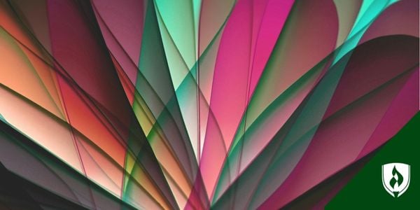
35. Radial
A design where the elements radiate from a central focal point, spreading outward.
36. Golden Ratio
A mathematical ratio that is found in nature and continues to heavily influence graphic design. One of the more common simplified versions of the golden ratio is the rule of thirds.
37. Rule of thirds
This refers to the act of dividing an image with two vertical and two horizontal lines to help designers determine a visually appealing focal point and balance their composition.
38. Scale
The size of one object in relation to another design element. Extreme differences in scale can draw attention and create drama.
39. Skeuomorphism
A style of design that creates a digital imitation of a physical object. For example, the buttons found in the calculator app on your phone resemble the buttons of a real calculator. Skeuomorphic designs have the illusion of depth—so a skeuomorphic button looks like it can be pressed “in” or “out.”
40. Flat
The opposite idea of skeuomorphism is the flat design. This tends to be minimal with a bigger focus on space, crisp edges and two-dimensional images.
41 White space
White space includes any part of the design without an image or text.
Design terms: Color
42. Analogous colors
A combination of colors built out of shades close to each other on the color wheel. For example, red and orange.
43. Color theory
The study of how colors affect viewers mentally and emotionally—which can differ depending on the audience’s background. This is used to determine which colors create the energy the brand is seeking.
44. Complementary colors
This term refers to color pairs that sit opposite of each other on the color wheel and together create visual tension.
45. Cool colors
Cool colors like blues, greens and violets tend to have a calming effect. It’s simple to add a cooler look to a design by highlighting the blue tones. (See also “Warm colors.”)
46. CMYK
Also known as “four-color process,” this abbreviation stands for Cyan, Magenta, Yellow and Key, which refers to black. This is a color model that refers to the four inks used in some color printing. (See also “RGB.”)
47. Gradient
A gradual shift from one color to another based on the color wheel.
48. Grayscale
This term refers to a color palette that only uses black, white and the shades of gray in between. Black and white films are an easy example of grayscale in practice.
49. Hex code
A six-digit code that represents a specific color, often used in computer design programs.
50. Hue
The purest form of the original colors—red, orange, yellow, green, blue and violet.
51. Monochrome
A color palette built out of various shades and tints of just one color. This is similar to grayscale but encompasses all colors—for example, you could have a monochromatic image that is entirely shades of red.
52. Opacity
A measure of a color’s transparency. The higher the opacity, the less you can see what lies behind it. The less opacity, the more transparent the element is. A black circle, for example, has high opacity.
53. Palette
The selection of colors for a design—they typically complement each other and represent the brand well.
54. Pantone®
The Pantone Matching System is a standardized numerical classification of precise color identification for color printing, which makes it easier for designers to reference exact color shades.
55. RGB
This abbreviation stands for red, green and blue. It’s a color mode for all images shown through an electronic display, such as a computer or television. (See also “CMYK.”)
56. Saturation
The intensity of color in an image. Increased saturation causes colors to appear purer or more vibrant, while decreased saturation causes colors to appear more washed out.
57. Shade
The result of a pure hue with black added.
58. Tint
The result of a pure hue with white added. For example, pastel colors like pink or light blue.
59. Tone
The lightness or darkness of a design element. The tone of a hue can be changed by increasing the level of neutral gray.
60. Triadic
A color theme composed of three colors equally dispersed around the color wheel. In designs, this often works out to a split where one is the main or dominant color, another is used as a secondary support color and the other is used sparingly as an accent.
61. Warm colors
Warm colors refer to the reds, oranges and yellows that usually have an energizing effect. (See also “Cool colors.”)
Design terms: Typography
62. Ascender
The upward stem on some lowercase letters like “d”, “b” or “h” that extend beyond the median of the letter.
63. Baseline
The invisible line that the letters rest on and align with. The baseline determines where the x-line is and what’s a descender or ascender.
64. Descender
The downward stems on lowercase letters like “p”, “g” or “j” that extend below the baseline.
65. Display type
Large, prominent type designed to catch the viewer’s eye. For example, movie titles on posters, newspaper headlines and article titles.
66. Font weight
Indicates the thickness of a font. For example, bold type has a heavier font weight.
67. Hierarchy
System for grouping text based on the order of the content’s importance so the reader can easily navigate through the content.
68. Kerning
The process of adjusting the spacing between specific characters in a font, which helps you to create proportional and balanced typography.
69. Leading
Pronounced “ledding,” leading is the space between lines of a font. When the leading is too small, the content can be difficult to read. On the other hand, leading that is too loose can feel disjointed.
70. Legibility
Describes how easy it is to read a block of text and distinguish each letter.
71. Lorem ipsum
Lorem ipsum is a form of “filler” used as a placeholder for text in a design. This scrambled “Latin” text allows designers to create design layouts without having access to the final written copy.
72. Orphan
This term refers to the words or short lines at the beginning of a paragraph. These words are isolated from the rest of the content, often causing an unwanted focal point.
73. Widow
These are the words or short lines at the end of a paragraph that can cause an unwanted focal point.
74. Pica
A typesetting unit of measurement equaling one-sixth of an inch.
75. Pull quote
A short excerpt from the main text of an article or long copy that is displayed prominently to highlight the most important concepts, often used in magazines.
76. Sans serif
A style of typeface in which there are no small lines at the end of each character stroke. Common sans serif typefaces include Arial, Helvetica and Verdana.
77. Script
A kind of a typeface that resembles cursive handwriting and can appear more polished or casual depending on the details. Script examples include Milasian, Leckerli One and Good Vibes.
78. Serif
The little edges that stick out from letters in certain typefaces. For example, at the end of the letter “T” at the top left, top right and base of the letter. Common serif fonts include Times New Roman, Georgia and Garamond.
79. Slab serif
A category of typeface composed of thick, sturdy lines, often used for headlines. Examples include Archer, Rockwell and Neutraface Slab.
80. Tracking
Similar to, yet significantly different from kerning, tracking involves adjusting the spacing throughout an entire word. Once kerning has been used to determine the right spacing between each letter, tracking can be used to change the spacing equally between every letter at once.
81. Ear
A small stroke extending from the upper-right side of a lowercase “g” or a lowercase “r.”
82. Pilcrow
A symbol (¶) used to mark a new paragraph or section of text.
83. Swash
An additional flourish in typography, normally marked by an exaggerated serif, a tail, entry stroke, etc.
84. Ligature
A set of two or more characters that blend into a set.
85. Monospaced
A typeface where all characters take up the same amount of horizontal space.
86. Terminal
Any stroke that doesn’t finish with a serif.
87. Tittle
A small distinguishing mark like the dot on a lowercase “i” or “j.”
Design terms: Branding
88. Brand
The conceptual way your company is perceived—its values, tone, aspirations and ethos. These ideas translate into many aesthetic elements designers consider.
89. Brandmark
A specific type of logo that uses a symbol instead of the company name, like the Nike Swoosh®.
90. Brand identity
The visual version of your brand which can include a logo, slogan, website, packaging and other marketing materials.
91. Emblem
A logo that encompasses the company’s name using various shapes and frames—for example, the NFL shield logo.
92. Lettermark
Logos featuring stylized letters, usually a company’s initials, so the viewer can tell what brand they’re engaging with by just two or three letters—for example, IBM and CNN.
93. Pictorial mark
Specific, strictly visual icons that represent a brand, like the Target bullseye or the McDonald’s arches.
94. Style guide
A set of design standards for a specific brand to ensure complete consistency in the style and formatting of design assets. This often includes guidelines for color schemes, typefaces and how logos are used and placed within an asset, among others.
Design terms: Finishing processes
95. Die cut
A finishing process of cuts done after printing to create a unique shape or texture.
96. Foil stamping
A method, also called hot stamping, of melting foil or pre-dried ink to a design to create a metallic finish.
97. Embossing
The practice of using a printing press’s metal plates to create dimensional indentations by raising the area up.
98. Debossing
The opposite of embossing, this process lowers the selected area to create an indent.
99. Trim
This is where your printed piece will be cut down to its correct size. Trim represents the final dimensions of your project.
100. Printer’s proof
A print or an object that a manufacturer receives as proof of the work. Usually made alongside the actual edition, though they are not intended for sale.
Ready to apply these graphic design terms?
If you find these graphic design terms and concepts exciting, you probably have the heart of a designer. For many design professionals, this terminology is the lingo of their everyday work.
Talking the talk is one thing but thriving graphic designers don’t just understand these tools and techniques, they use them to create. And in graphic design, there are many different skills, tools and platforms to enhance the power of your work. Find out more in our article “Cutting-Edge Graphic Design Skills Employers Are Seeking.”
Pantone is a registered trademark of Pantone LLC.
Adobe Illustrator and Photoshop are registered trademarks of Adobe Systems, Inc.
Microsoft Word is a registered trademark of Microsoft Corporation.
FedEx is a registered trademark of Federal Express Corporation.
Nike Swoosh is a registered trademark of Nike, Inc.
EDITOR’S NOTE: This article was originally published in 2017. It has recently been updated to include information relevant to 2022.